Your logo is one of the most important aspects of your brand. It acts as your spokesperson, communicating on your behalf to current and potential customers. It must be easily recognizable while also exemplifying your brand. Take a moment every few years to objectively look at your logo and determine how well it’s serving you. Here are some pointers.
1. Does your logo translate from full color to one color, while still looking clean and recognizable?
Some designers even start their process in black and white to eliminate having to make this transition later on. If your logo cannot translate into one color you might need your designer to create an alternate logo, in which shapes are simplified, outlined, or separated more.
Why would you need a one color logo when you only plan on using your logo in full color? There are many special circumstances that may arise for your brand where you’ll need a one color logo, such as stamps, embossed versions, and signage.

2. Is your logo unique and memorable?
If it’s made with stock images or an online logo generator, the answer is probably a negative. A logo that’s unique is extremely important, and increasingly harder to find. When it comes to the icon, oftentimes uniqueness is sacrificed for being literal to what your brand does or company name. Remember, some of the best logos throughout history have nothing to do with the meaning of the company’s name or the product. They can pay homage to the history of the company (Starbucks), be a showcase of one of the letters in the company name (WordPress), or just be abstract symbolism (Pepsi).

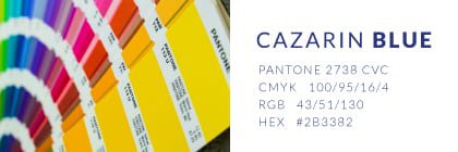
3. Does your logo have specified Pantone colors, as well as CMYK and RGB colors?
These standardized color specifications will help keep your brand consistent in print materials.
Not sure what these are? Pantone is a company that makes a large number of specific inks that are always consistent in color. CMYK color is likely what your printer at work uses, when it mixes 4 primary colors to make any colors in your document (Cyan, Magenta, Yellow, Key [black]). Because every printer is different, CMYK printing can result in very slight color inconsistencies. RGB (Red, Green, Blue) is the color space that screens and monitors use. Having these three color types determined for your logo will help ensure your brand colors come out looking right every time.

4. How your logo is used is just as important as how it looks.
Decide what version or what colors you’ll be using for print materials, in one-color contexts, and with or without text. If your logo has ever been updated, ensure that everyone is consistently using the newest version. Make sure your logo is used in places where it remains readable. It should have a margin around it to give it space and room to breathe.
Consider creating a brand guide that clearly defines how your logo, company name, and tagline are to be used in different situations.

5. Does your logo scale down well?
Your logo will inevitably need to be seen at very small sizes, and it will need to remain distinguishable when this happens. If your logo looks muddled when scaled down, create an alternate, simpler version. For social media it is also important to have a small avatar version. This can be just the icon part of your logo or it can be a unique letterform in your logotype. It should fit into a square while remaining bold enough to distinguish at very small sizes (such as on mobile devices or next to YouTube comments).

6. Is it obvious that your logo was designed 5 years ago?
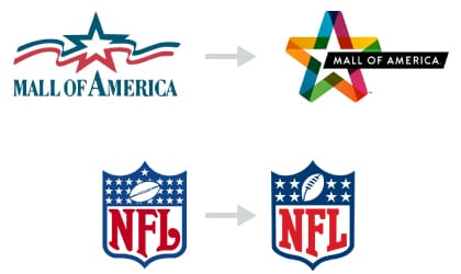
Trends in the design world change quickly; it’s important that your logo doesn’t look dated. Ideally your logo will be timeless. But as no one can predict the future and it’s hard to anticipate where design trends will go, it will more than likely look a bit dated after a while. To keep up with the times, logos can be completely redesigned (MoA) or just slightly revamped (NFL).

Remember, there is no exact recipe for a successful logo. There are plenty of good logos out there that may not follow all of these rules. Is your logo up to snuff? If it’s not, we can help!


