6 Types of Powerful Infographics and How to Use Them in Your Marketing Campaigns
The infographic is a powerful tool that takes a complex concept and communicates it in a visually appealing and digestible format. At Cazarin Interactive, we frequently design captivating infographics for our clients to use across their marketing channels.
We recently covered the value of using infographics in your marketing strategy and all the ways they can improve your brand. But, there is so much more to explore about this impactful marketing tool! In this blog post, we will break down six of our favorite infographic styles and share examples of how these have helped to boost various marketing efforts.
Infographic Type #1 – The List
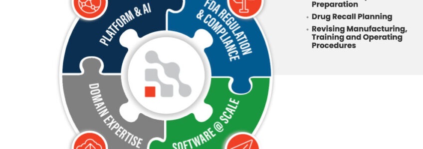
A list infographic is perfect for when you want to support a claim through a series of steps. It is also a great way to organize the services your company offers. And guess what, a list doesn’t always have to be linear! You can take a list and put it in a circle, square, or any shape that slows the viewer through its many properties.
You can also make them interactive like this one on the capabilities section of this homepage we designed for our client. When hovering over sections of the graphic, more information is pulled up. This helps users stay engaged on the page and helps compress information in a visual format, when in another case it would have just been another block of text.
Infographic Type #2 – Maps
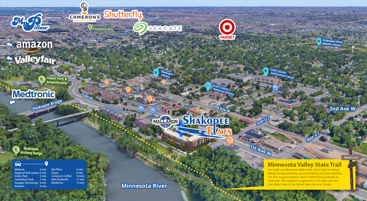
If you have any sort of location-centric data, a map infographic is a great way to communicate that with your visitors. For example, if your business has multiple locations and various services or roles are distributed around those locations, a map is a great visual to help your customers know what to expect.
We helped our client market their new apartments with this fun and interactive map that shows prospective tenants the popular destinations in the area.
Infographic Type #3 – Comparisons
Also known as a “versus” infographic, these can be used to highlight a number of things. They’re not only showing the differences between two things, but similarities between two unlike things. They can also prove why one option is better than another.
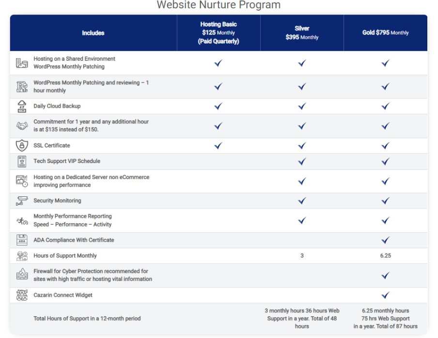
If you have multiple tiers of services, this type of infographic is incredibly helpful to direct customers to pick a plan that works for them. It’s especially useful when your services overlap, and some tiers include parts of another service, but have some differences. Mapping out your services into an infographic is not only helpful to the customer, but guides business owners into organizing their offerings into clear cut categories and helps them find clarity on the ways they help customers solve problems. Many service-based businesses have complex offerings, or their services are customized for their clients. When it feels this complex, we promise you there is a way to clarify it in a way that consumers will understand. A comparison infographic brings this messaging home.
Maybe your services are similar to others. But, we know you have a leg up on your competitors, so consider an infographic that shows what you have that others do not.
We used a comparison infographic to to communicate the tiers of our signature Website Nurture Program. For a service that includes a number of complexities, the infographic on this page helps show our customers exactly what they are getting.
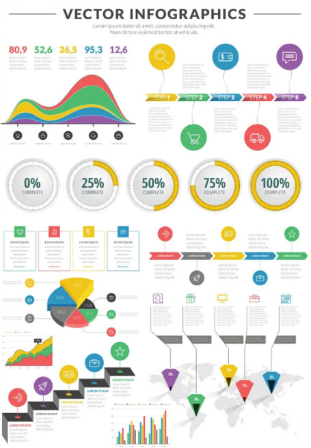
Infographic Type #4 – Data Visualization
How do you make the facts and statistics that matter to your business interesting to absorb? A data visualization infographic, of course.
How about your annual report? Break down the numbers for your employees in a share-able format with an infographic that charts out how money was allocated this year. Anything you think is “too complicated to explain”, we can promise you it is not.
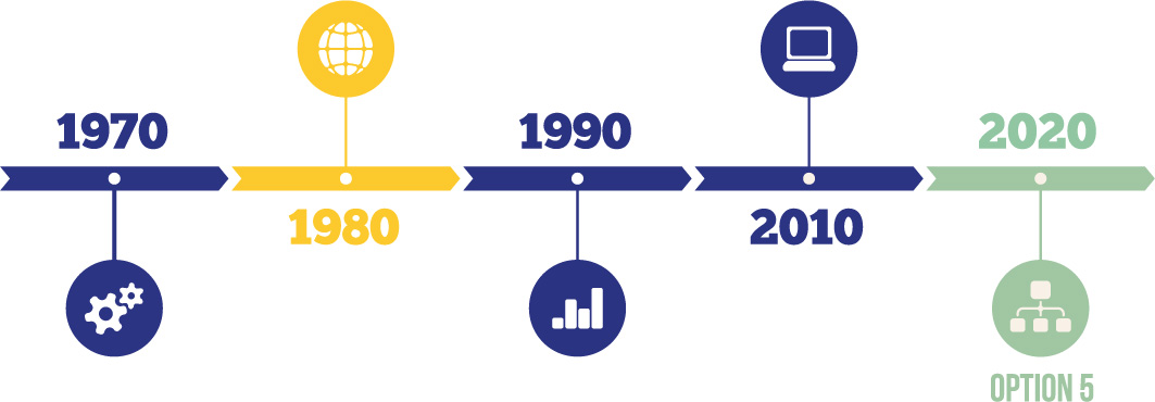
Infographic Type #5 – Timeline
When we celebrated our 25th anniversary, we knew there was no better way to map out our progress over that time than with a timeline. We know your business has come a long way from where it began and a timeline is a great opportunity to show that journey to your customers.
When customers begin working with you, what is your timeline for completing a project? A timeline infographic will give clients clear expectations of when they can receive materials they need, as well as show where they are currently at in their customer journey.
A timeline infographic also helps communicate cause and effect information to show your customers how one thing leads to another.
Infographic Type #6 – Process
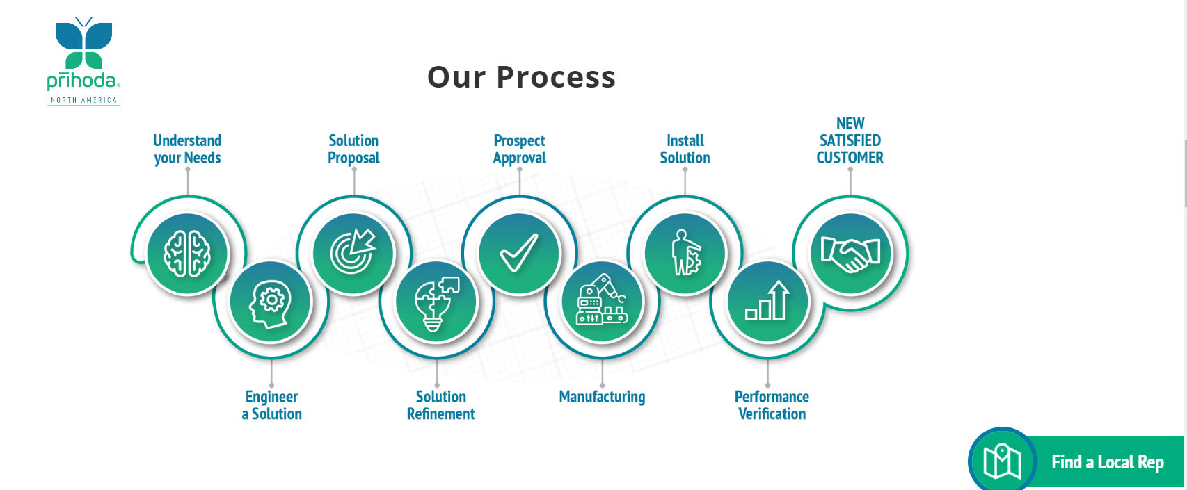
A process infographic helps explain the steps your business takes to help your customers. We are sure you have a way of vetting clients who will come to work with you and explaining this on your website is a helpful way to help drive the right people to take the actions in step one. See our example we have on our website, which shows our process for our signature Marketing Fusion service.
An infographic like this means customers and prospects don’t have to ask you, “what’s next?”
For our client, Prihoda Fabric Duct, we created this process infographic to simplify the many steps they take when they take care of their customers:
Your company has mastered providing simple solutions to complex problems. We want to help you communicate that value through simple infographics that lead to conversions. Contact Cazarin Interactive today to improve your brand and create joy together while doing so.


